The brief
Beatus needed to look like a modern, professionally managed property income platform rather than another letting agent. The brand had to communicate reliability, innovation and peace of mind to property owners, people handing over an asset worth hundreds of thousands of pounds and needing to feel certain about it.
What we did
The reference points were not other agents but the clean simplicity of brands like Monzo and Airbnb: minimal, contemporary, digitally native, approachable. The risk with that direction is looking lightweight in a sector that trades on credibility, so the monogram is bold and deliberate, the spacing generous, and the warm coral is balanced against charcoal and cream.
The result
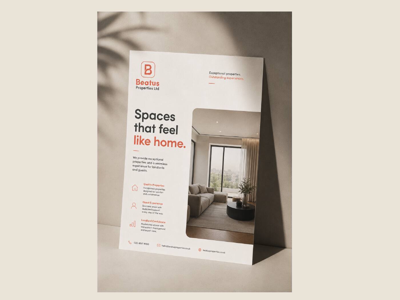
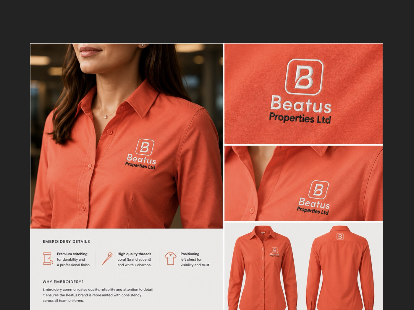
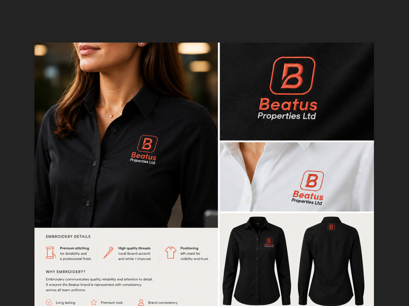
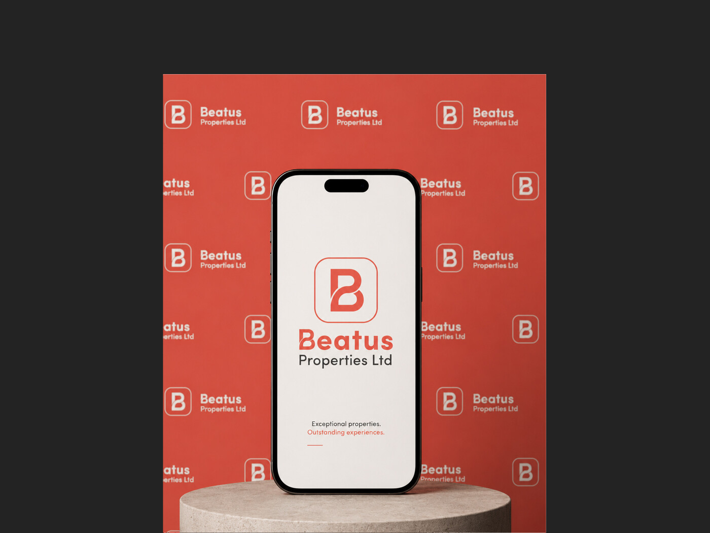
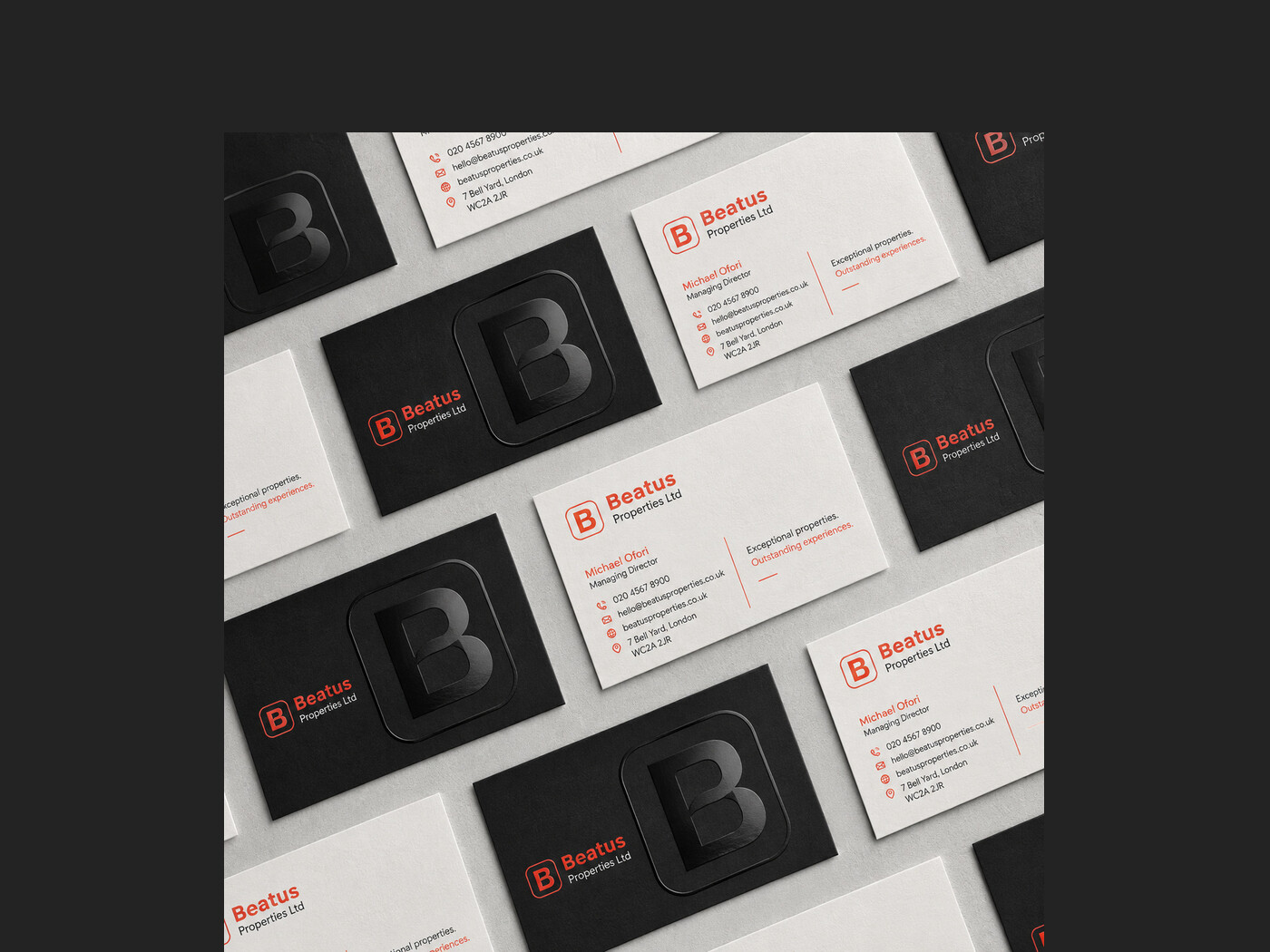
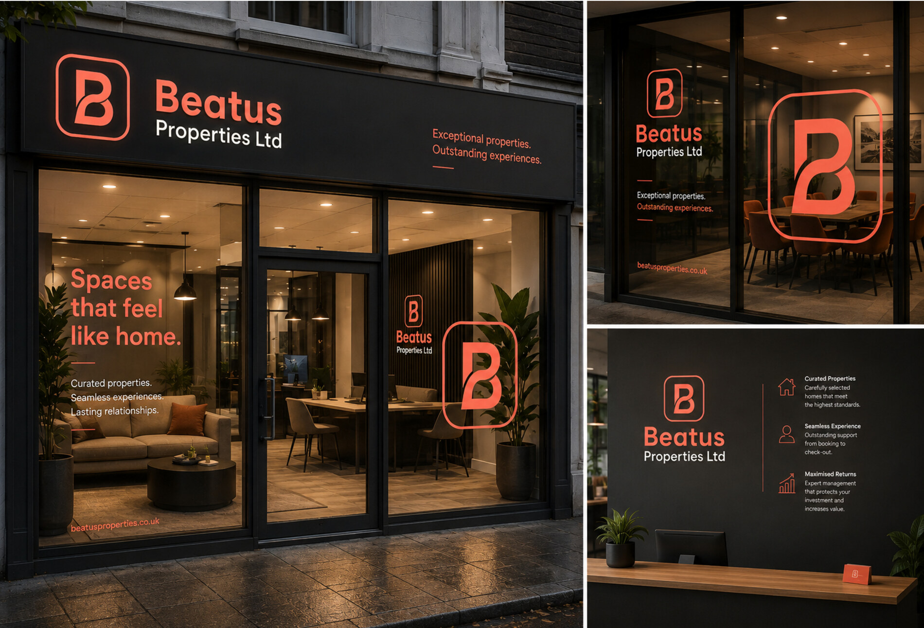
The identity carries across a shopfront, reception wall, stationery, brochures, presentation material and embroidered uniform, every touchpoint an owner meets before and after they sign.
- Client
- Beatus Properties
- Sector
- Property management
- Services
- Brand strategy, Identity, Stationery, Print