The brief
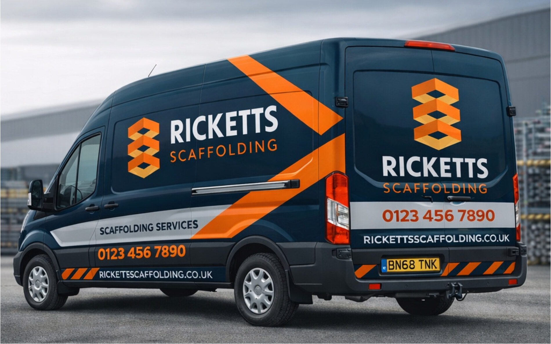
Ricketts needed an identity that reflected the strength, reliability and precision the job demands, and that stood out in a crowded local market. It also had to be genuinely practical. Most of the brand’s working life is spent on the side of a van at forty miles an hour, or on a site board seen from across a road.
What we did
The mark is built from stacked scaffold platforms: geometry drawn from the work itself rather than the usual hard hats and hazard stripes. Deep teal carries the professionalism, high-impact orange does the visibility, and the typography is set heavy and wide enough to read at distance.
The result
One system that holds from a business card to a full vehicle wrap, with the mark working equally on teal, on white and embroidered onto hi-vis.
- Client
- Ricketts Scaffolding
- Sector
- Construction & scaffolding
- Services
- Brand identity, Vehicle livery, Workwear, Signage