The brief
Håkon build extensions, new builds and renovations, work that is bought on trust long before anyone can see a finished project. For most homeowners the brand is the only evidence they have to go on at the point of deciding. It needed to signal care and permanence rather than shout, and to sit comfortably beside the Federation of Master Builders mark without being crowded by it.
What we did
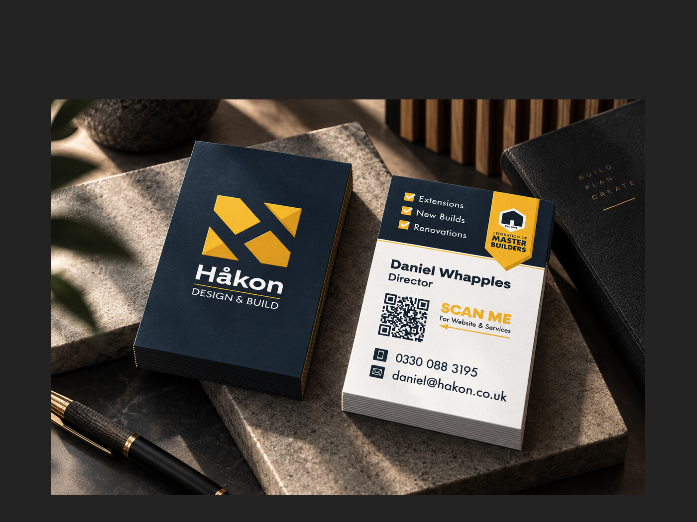
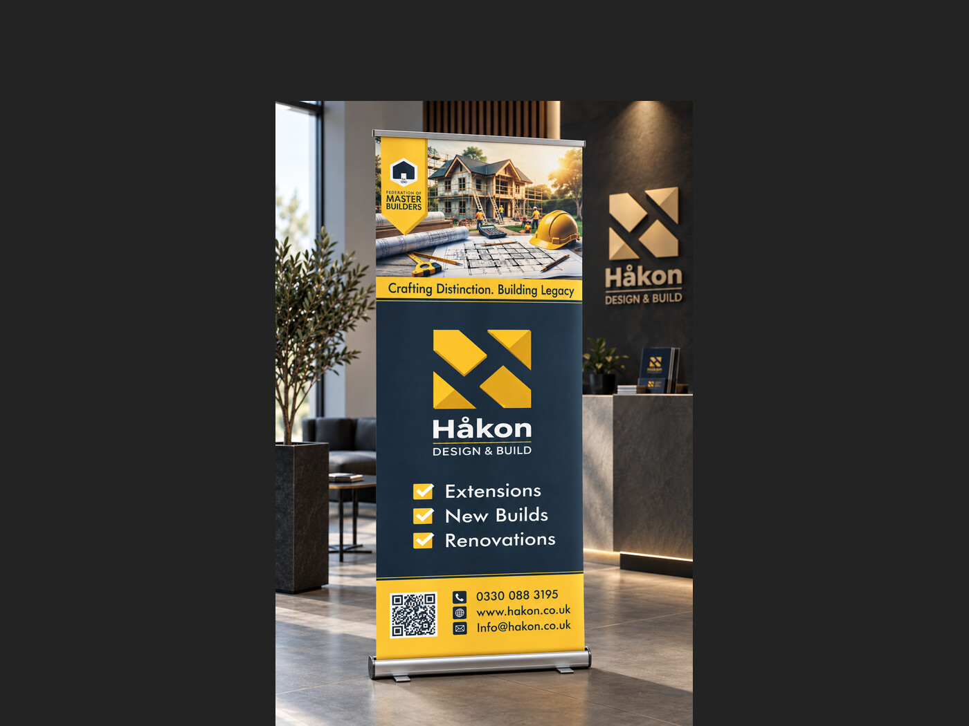
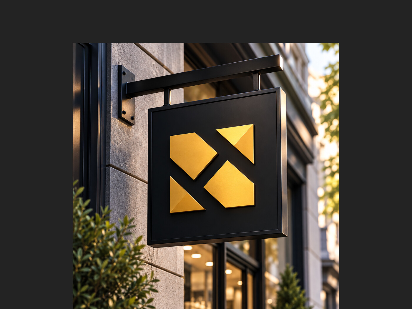
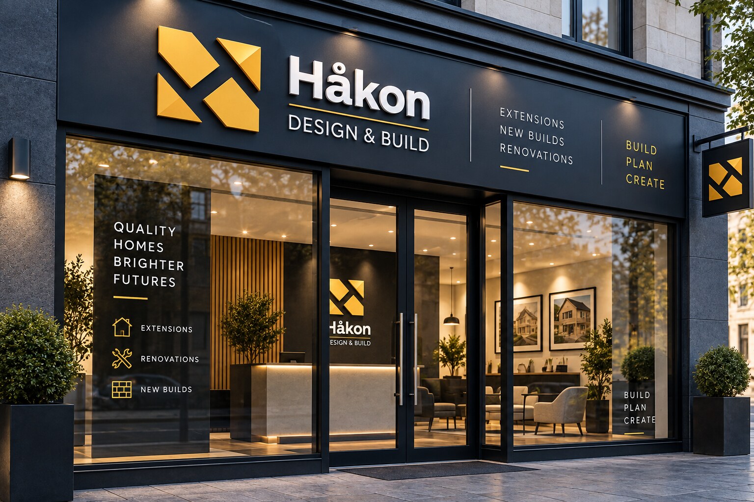
The monogram is an H cut from four angled blocks: construction geometry that reads as a mark rather than a picture of a house, and that keeps its shape whether it is brushed brass on a black tray sign or a single flat colour on a van door. Deep navy carries the weight, one brass yellow does all the warmth, and the lockup, service list and strapline stack to the same grid at every size.
The result
One system that scales from a business card to an illuminated fascia, stays legible on a moving vehicle, and gives every piece of material the same quiet authority.
- Client
- Håkon Design & Build
- Sector
- Design and build
- Services
- Brand identity, Signage, Vehicle livery, Print