The brief
Bookkeeping is a trust purchase made largely on instinct. Aurora needed an identity that read as rigorous without being cold, one that would stand comfortably beside the accountants and practices they compete with for Dorset's small and medium businesses, while still sounding like a person rather than a firm.
What we did
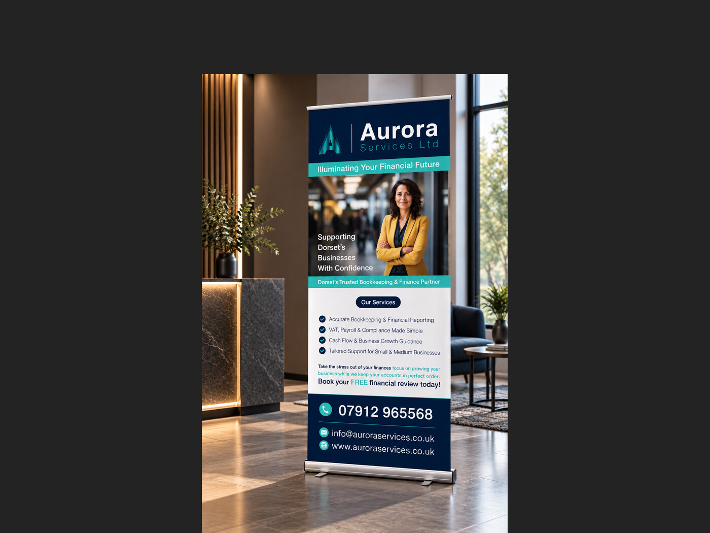
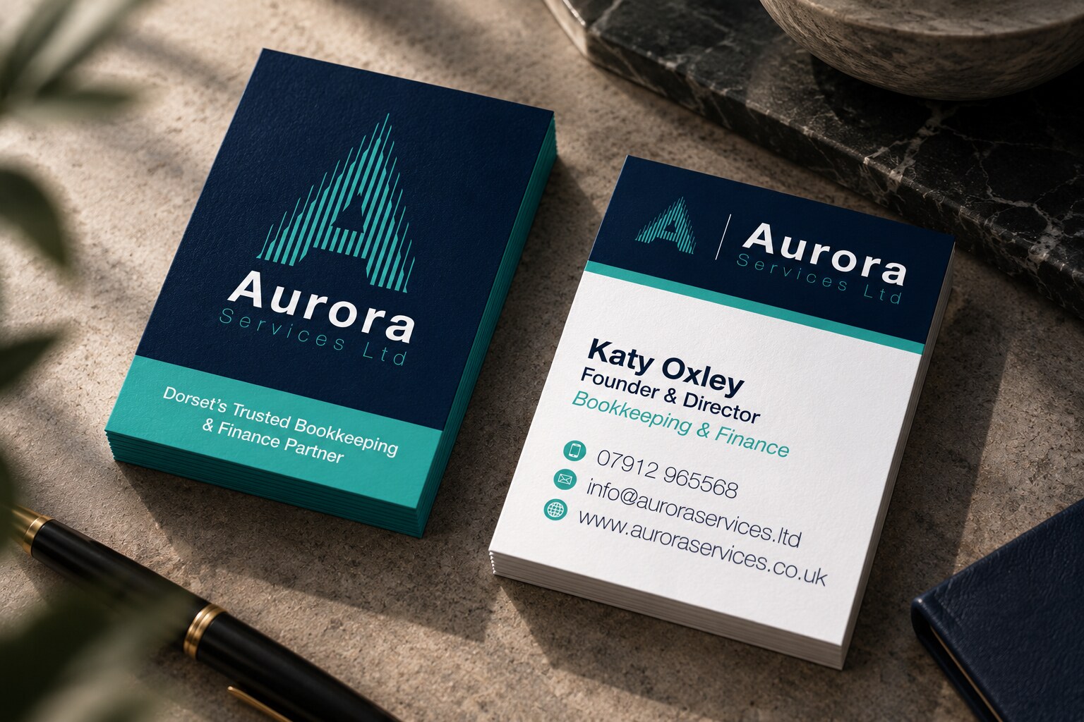
The mark takes the aurora in the name literally: an A built from fine vertical strokes that fade upward like light across a night sky. Deep navy does the credibility, a single teal carries the warmth, and the strokes give the identity a texture that works as a watermark, a card edge or a banner header. The wordmark is set tight and confident, with Services Ltd spaced out beneath it so the name reads first.
The result
A system that holds from a business card to a two-metre pull-up banner, with the same mark doing the work at both ends, and a positioning line, Dorset's trusted bookkeeping and finance partner, that says plainly who it is for.
- Client
- Aurora Services Ltd
- Sector
- Bookkeeping and finance
- Services
- Brand identity, Stationery, Print