The brief
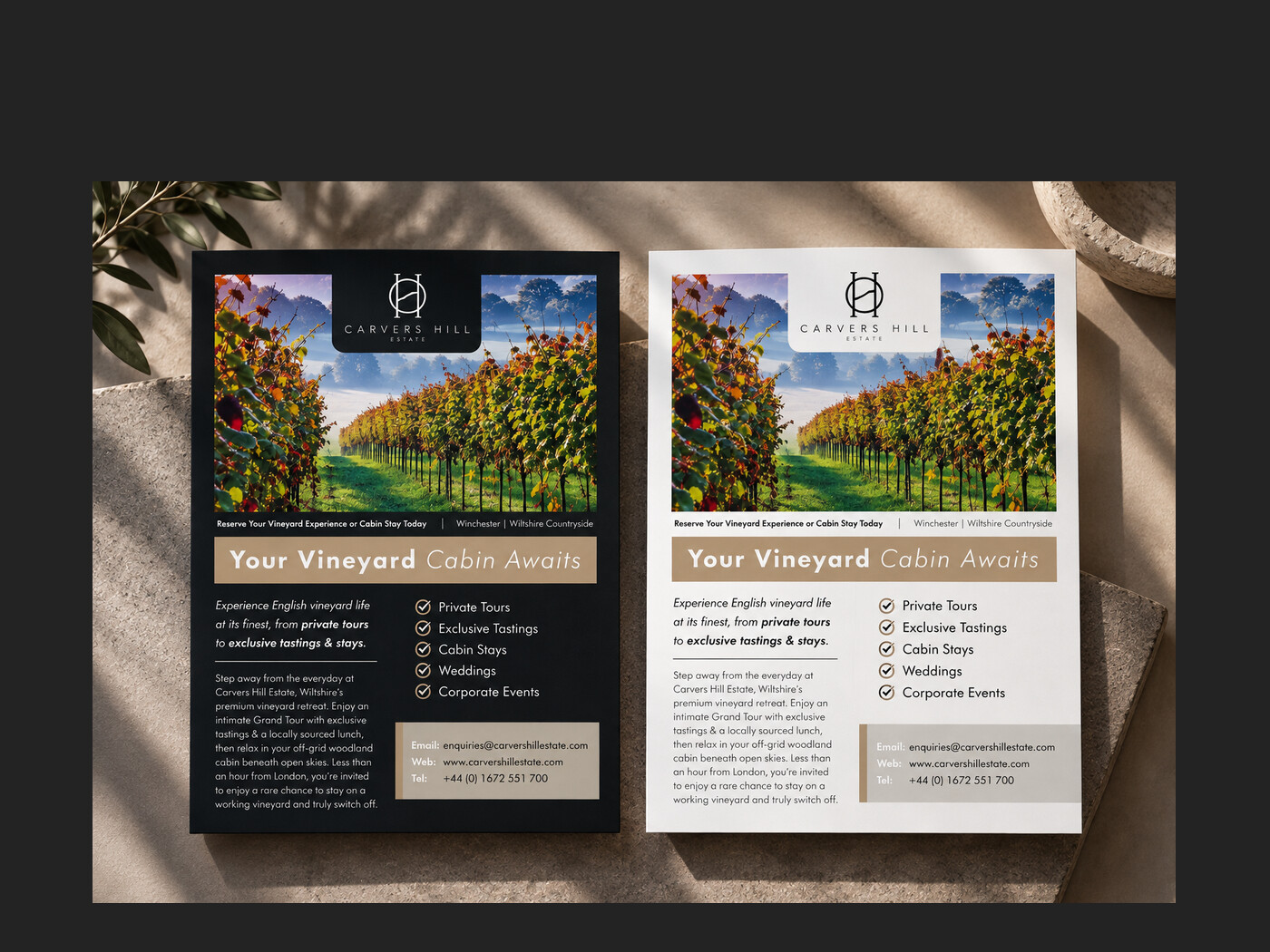
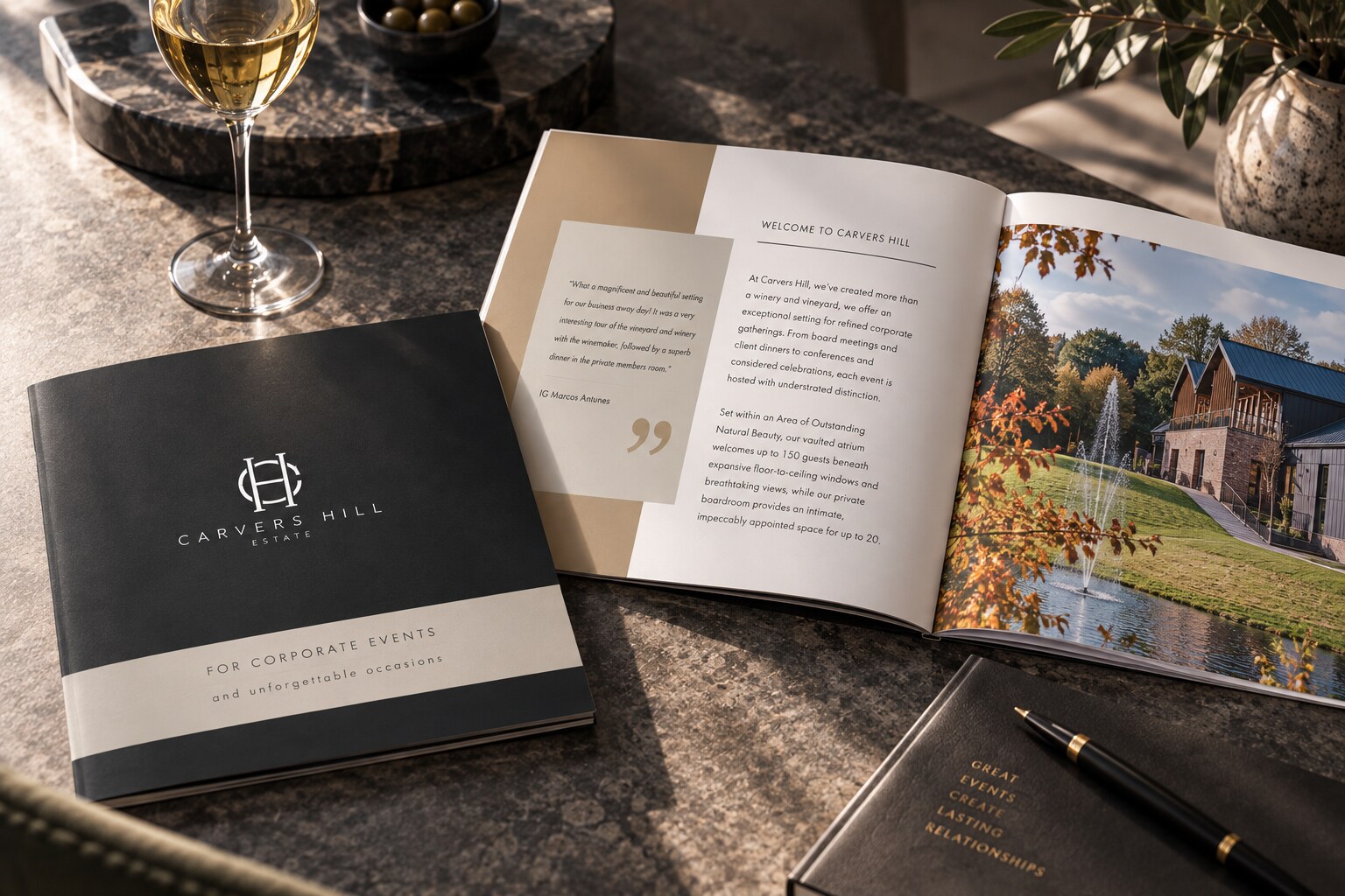
Carvers Hill came to us with the identity already settled and no wish to change it: the monogram, the black and taupe palette and the wide-set capitals were all in place. What they needed was print that carried the same restraint: a corporate events brochure and a pair of flyers that would do the selling for a venue most people have not yet visited.
What we did
Designed to the brand rather than around it. Generous margins and slow, wide type let the photography do the talking, because the estate itself is the strongest argument they have. The brochure opens on the building and the vineyard before it says anything about capacity; the flyers were set in two colourways, one on black and one on white, so they work against a dark backdrop or a bright one without a redraw.
The result
Literature that a premium venue can hand over without apology, and that sits beside the existing brand as though it had always been part of it.
- Client
- Carvers Hill Estate
- Sector
- Vineyard estate and events venue
- Services
- Brochure, Flyers, Print