The brief
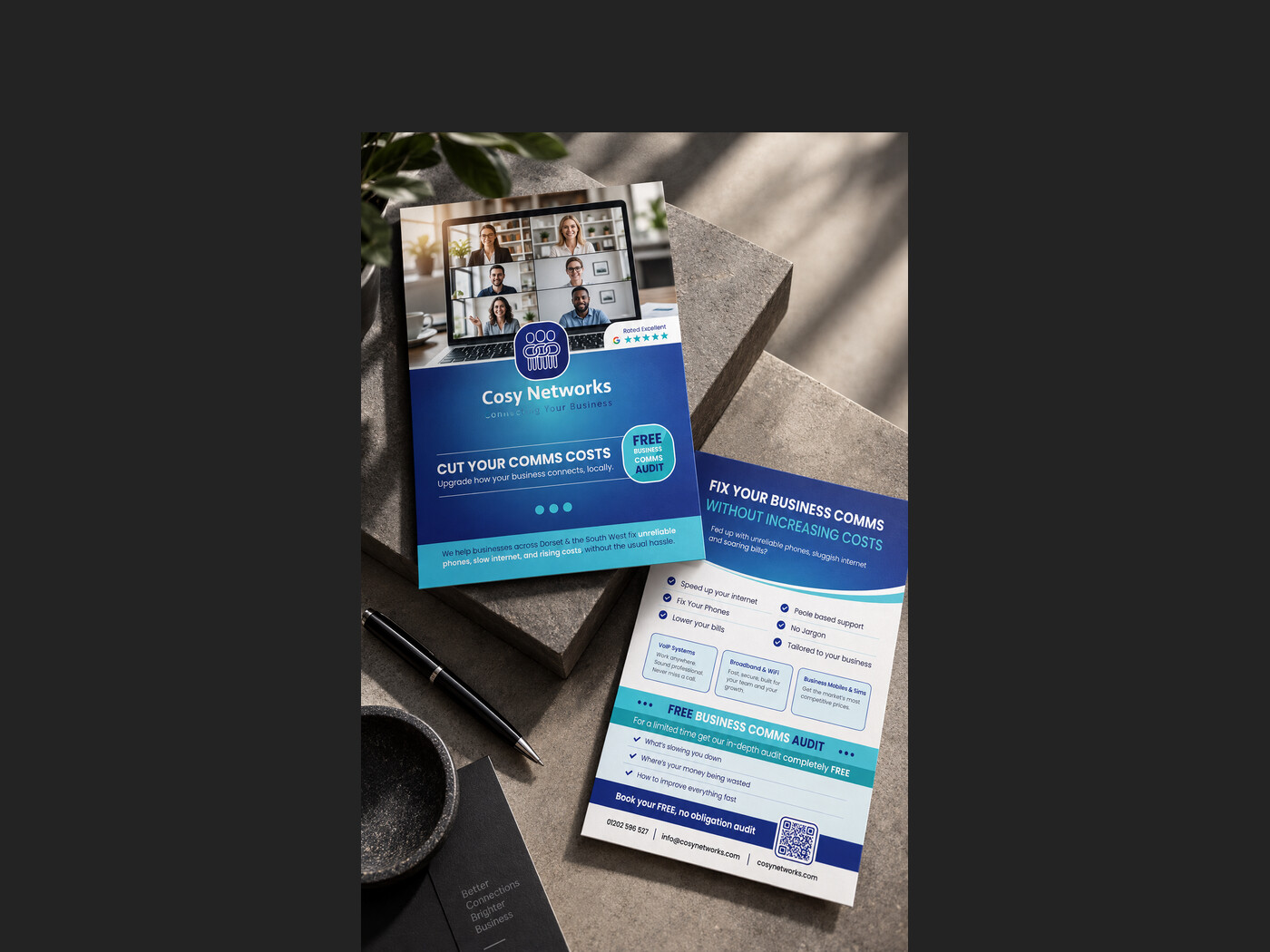
Cosy Networks sell phone systems, broadband and business mobiles to companies across Dorset and the South West, a category where every competitor makes the same promises and the product itself is invisible until it goes wrong. They had a logo they were attached to but that was not holding up in print, and nothing to leave behind after a meeting.
What we did
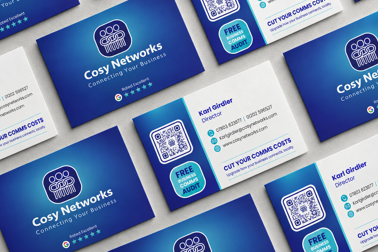
Refreshed the logo rather than replaced it: the same idea, rebuilt so it stays legible small, on a dark gradient and in a single colour. Then built the material around it: cards and a two-sided leaflet in a blue that runs from deep navy to a bright cyan, so the brand reads as technical without turning cold. The offer does the heavy lifting: a free comms audit, given a badge of its own and repeated on every piece, with a QR code so the reader can act on it immediately.
The result
A set of material built around one clear ask rather than a list of services, and a mark that now survives being printed at the size of a fingernail.
- Client
- Cosy Networks
- Sector
- Business telecoms and connectivity
- Services
- Logo refresh, Stationery, Print